
1. Traffic vs. Conversion? The "Empty Visitor" Fallacy in Corporate Websites
Many businesses measure digital marketing success solely by the number of visitors entering their website (Google Analytics sessions). Tens of thousands of liras are allocated to ads, and thousands of clicks are generated through SEO efforts; however, at the end of the day, the company phone does not ring or the quote forms remain empty. The root cause of this is that the site is designed like an art gallery, yet it completely lacks a conversion-driven web design architecture that guides the visitor toward a purchasing decision.
A website that fails to convert visitors into customers is like pouring water into a leaky bucket. Scenario example: A site that receives only 10 quotes from 10,000 visitors (0.1% conversion) can reach 300 qualified quotes from the same traffic (3% conversion) with the right CRO strategy and user experience architecture. Real growth does not happen by spending more on ads, but through interface engineering that turns existing traffic into business opportunities.
Core CRO Principle: In the digital world, traffic is a cost; conversion is the only output that transforms this cost into profit and permanent corporate revenue.
2. What is CRO (Conversion Rate Optimization)? The Fogg Behavior Model
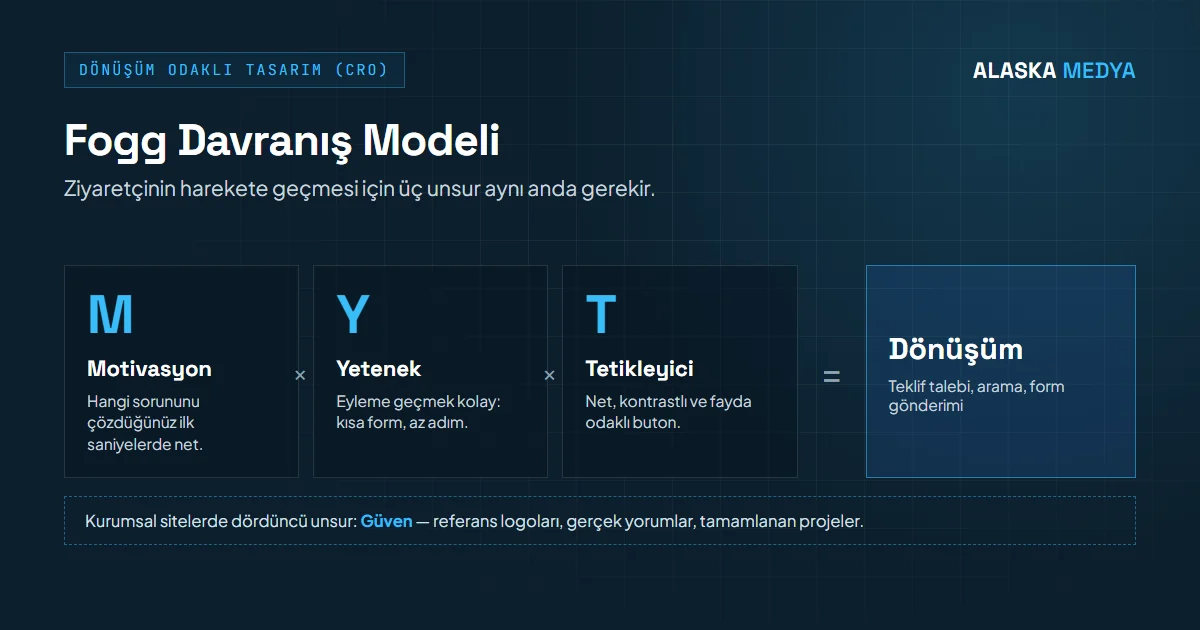
Conversion Rate Optimization (CRO) is the combination of user psychology, eye-tracking, heatmaps, and interface ergonomics. For a user to perform an action on your site, in accordance with Stanford University's Fogg Behavior Model, three elements (motivation, ability, trigger) must come together simultaneously. In corporate websites, trust is added as a fourth element:
Motivation (Value Proposition)
Within the first few seconds, the user must clearly receive the answer to the question: "Which problem of mine does this company solve?" Cliché slogans kill motivation.
Ability / Simplicity (Low Cognitive Load)
The easier it is to take action, the higher the conversion. While 12-field forms make action difficult, practical 3-4 field forms minimize friction.
Trigger (Contrast CTA)
Clear, contrasting, and benefit-oriented action buttons guiding the user to the next step (e.g., 'Request a Free Discovery').
Social Proof and Trust
Concrete reference logos, Google ratings, ISO certificates, and completed project counts that lower the user's perception of risk.
3. Comparison Table: Classic Showcase Site vs. CRO Sales Architecture
Structural differences between traditional websites and a modern corporate infrastructure designed with a focus on conversion:
| Design Dimension | Traditional Showcase Site | Alaska Medya CRO Architecture |
|---|---|---|
| Visitor Flow | Disorganized, aimless navigation (User gets lost) | Linear guidance via Funnel model |
| Hero / Above the Fold | Meaningless rotating slider banners, slow loading | Clear Value Proposition + Direct Action Button |
| Call to Action (CTA) | Small, faint 'Contact' link in the menu | Rhythmic, contrasting, and appealing buttons throughout the page |
| Contact Forms | Tiring fields containing 8-12 unnecessary questions | 3-4 field micro-form, instant feedback |
| Mobile Interaction | Small links, difficult-to-copy numbers | Sticky one-tap call & WhatsApp |
| Conversion Rate | Low; traffic does not turn into quotes | Significantly higher (Revenue & ROI increase) |
4. 6 Fundamental UI/UX and Cognitive Rules That Maximize Conversion
6 engineering rules applied in Alaska Medya projects that accelerate the user's decision-making process:
F and Z Reading Patterns
Based on the eye's natural scanning route, critical headings are placed on the top left, and the most important action button is placed at the point where the eye naturally arrives along this scanning route.
The Power of Whitespace
Cluttering the page with information locks perception. Spacious empty spaces in the Swiss grid layout make the quote area stand out like a magnet.
Frictionless Forms
Features like auto-complete on mobile keyboards (autocomplete), clear error warnings, and transparent privacy assurance are provided.
Risk Reversal
The user's hesitations are eliminated with phrases like "Free Quote", "Same-Day Response During Working Hours", or "Non-Binding".
Micro-Interactions & Hover Effects
Subtle color changes and click sensation when hovering over buttons subconsciously convey to the user that they are in the right place.
Mobile One-Touch Actions
The 'Call Now' button remaining fixed at the bottom while scrolling on the mobile screen connects the customer with intent to call to the switchboard with a single tap.
5. Conversion-Driven Approach in B2B and Industrial Companies
While conversion on consumer-facing e-commerce sites is an instantaneous credit card charge, conversion in B2B industrial, engineering, or foreign trade sectors is a qualified technical specification request or a factory visit appointment. Purchasing cycles can take months, and decisions are made not by a single person, but by a board of directors or a technical committee.
Therefore, interface design in B2B sectors must prove the company's production capacity, machinery park, test certificates, and delivery discipline beyond a shadow of a doubt. A customer-winning corporate web design approach that combines corporate seriousness with sales power sets your firm apart from price-cutting competitors in the industry and brings you qualified projects.
6. Conversion Balance Between Corporate Website and Landing Page
Your main corporate website is a broad headquarters hosting all company services, corporate identity, and sectoral authority. However, if you are directly promoting a specific service or campaign via Google Ads or Meta ads, directing the user to the homepage leads to conversion loss.
To convert ad clicks directly into sales opportunities, high-converting landing page design models stripped of all menus and distracting external links, locked onto a single goal, must be put into practice.